BRUXAWAY INC. MOBILE APP
Access sleeping quality feedback and bruxism levels through the mobile app.
MY ROLE
I was the Lead UI designer for the mobile application.
I had to design a mobile app where patients would be able to access their bruxism information and their synced data from the bruxAway night guard. They would also be able to access their progress and further details on their sleeping quality every night.

UNDERSTANDING THE USER
When making the mobile app, I wanted to ensure the user would be able to navigate through the app with no issues.
As I was thinking about how to demonstrate to people the functions of the app, I made sure to incorporate the common navigation icons used in many popular mobile apps. For example, the universal indication of a "back" feature, is by placing a left-pointing arrow somewhere on the screen to tell the user how to go back a page. You can find this feature if you scroll further down to find the video going through the user flow.
Since the company wanted to present a clean and simplistic style across the website and application platforms, I decided to follow the same design strategy I used in the bruxAway website. By sticking to 3 or 4 main colors, it helps the user feel more comfortable using the application. Ensuring the design is clean demonstrating proper use of space and contrast, avoids people feeling overwhelmed from the content presented at them. A bright color palette also brings out a calm ambiance with a sense of simplicity and accessibility.
I made sure all features and buttons were visible and bold enough to find. These including back and forward arrows, log in/sign up buttons, and the hamburger icon to symbolize an expandable/collapsable menu bar.

BREAKING DOWN THE PROCESS
To make the mobile app, I first wrote out all the steps I needed to follow to create the final mockup.
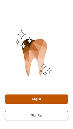
I first defined the functionality of the app. For example, in order to access one's bruxism data, they need to have a way to log in or sign up. This is where I created the introductory welcome pages as shown below for the app to access further features.
I then went ahead and began sketching the low-fi design of the app on paper. I took my drawings and passed it over onto digital versions using Adobe XD and began designing the features for the app like a dashboard page and a settings section. These portions are demonstrated above for the welcome pages.
I planned the app's workflow and paid attention to the user's goal flow. This consisted of identifying the user's problem or need, what the expected goal would be, and what would be the steps to get there. Once I was done deciding these steps for portions of the app, I proceeded to create the wireframing and user flow. Finally, I made sure that all the interaction features I made on Adobe XD for the app worked on a mobile device in real-time and had people provide feedback on their experience navigating through.


TITLE OF THE CALLOUT BLOCK
LESSONS LEARNED
Web UI interacts are completely different from mobile app user interface interactions.
When I began working on the mobile app after finishing the web app design, some functions such as the hover feature only work to its fullest potential on a computer device. That is when I understood more about the importance of testing your app on the designated device before showing it to the public.


