IBM DESIGN CHALLENGE
Redesigning the Hertz App for Car Rental
PROMPT
Design a better way for a mid-career professional who occasionally travels for work to find just the right vehicle when using the Hertz mobile app.
GOALS:
To investigate the app’s visual identity/branding, current user flow, target customer’s pain points, and design an improved rental car browsing process.
DISCOVERY
GOALS:
Design improved usability for the target user to find a car for work within the Hertz app.
Scoping:
Focus on the user’s experience when looking for a car.
Assumptions:
-
User is somewhat familiar with the ride renting process in an app, but not entirely confident in the ride rental service.
-
User is on the go and is looking for a reliable and fast renting experience.
-
User needs to feel comfortable and confident in the car they pick to rent and might seek additional help during this process.
Research Insights:
After conducting research on user pain points, I found evidence sharing a common theme. The target market just needs an app where they can “have a simple and easy searching experience while also getting detailed information on the car I want to rent.”
-
User asks for thorough information on the cars that show in the search since they may not fully comprehend car specs.
-
User appreciates an easy car search experience given they are “on-the-go” and might not know much about their destination.
-
User wants to feel they have control of the car they potentially rent out.
HERTZ APP FLOW:


COMPETITIVE ANALYSIS
In order to better understand ways to enhance the search experience and overall app usability, I looked into several other car rental apps: Turo and Enterprise. These were the top apps with good ratings in the App store following Hertz. I was able to gather a sufficient understanding on user flows and mind maps each company aims to achieve.
TURO APP FLOW:


ENTERPRISE APP FLOW:


USER TESTING
Due to the time crunch of the design challenge, I did not have user testing to conduct. Instead, I did a quick analysis of customer reviews of Heartz on the app store and concluded: the majority of customers want a quick and simple car rental search process for work travel. I also gathered insight that car features along with price were the most important to users and were wanting the ability to compare in between potential cars more efficiently.
They also stressed the importance of more accurate car categorizations in the filter sections and that the information provided about a car is more than half the time not even accurate of its real-life conditions.
PLANNING
GOALS:
-
Show the rental car info in a detailed and enjoyable way while also preventing the user from feeling overwhelmed.
-
Provide the user with an ability to compare between vehicles easier without going back and forth screens.
-
Reduce unnecessary information or user flow to shorten the time it takes to rent a car.
PLANNING: FILTER SCREEN
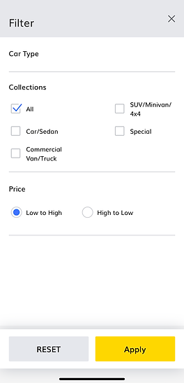
When looking over areas to redesign in the app, the filters section appeared to be missing some important filter options including price, safety features, gas mileage, storage space, and etc.
I made a note of this opportunity after noticing that Turo’s app had these features that Hertz was lacking, as seen on the second screen towards the right:
HERTZ
vs.
TURO

PLANNING: ITINERARY SCREEN

Hertz needs a new layout in the trip itinerary screen including a user log-in option with an icon and removing the repeated rental details on the top of the screen.
It also needs a clearer placement of the “View Vehicles” button at the bottom by adding some background color like the yellow banner at the top. Making this change would make it accessible for the user to view this button regardless of layout changes and screen sizing when scrolling down.
PLANNING: CALENDAR SCREEN
Visual cues or highlighting the circle on the selected date in the calendar screen would allow users to know whether or not they have successfully selected their car rental pick up/return within the same day.

At the moment, the Hertz app does not clearly demonstrate that users have the ability to select the same day as their pick-up and return date without having to exit this screen. You can see this issue on the second screen at the right through a video walkthrough:
DESIGN
GOALS:
-
Show the rental car info in a detailed and enjoyable way while also preventing the user from feeling overwhelmed.
-
Provide the user with an ability to compare between vehicles easier without going back and forth screens.
-
Reduce unnecessary information or user flow to shorten the time it takes to rent a car.
LOW-FI SKETCHES:

SYNTHESIS
TITLE OF THE CALLOUT BLOCK
SYNTHESIS:
After ideation and brainstorming changes needed to be made on the Hertz app, I went ahead and made a few prototypes from my low-fi designs as shown below in these videos:
PROTOTYPES:
CALENDAR REDESIGN
FILTER FEATURES REDESIGN
REFLECTION
TITLE OF THE CALLOUT BLOCK
SOLUTION & OUTCOMES
I was able to identify the following categories in the app that needed improvements: the vehicle filter options, review cart/itinerary screen, and the agenda/calendar date selection screen.
TIME
If I had been given more time on this challenge, I would want to conduct usability testing on the screens I redesigned and made interactive. I would also have added a less overwhelming screen where the user would add on additional search filters. Lastly, as a perfectionist with art projects, my strong focus for this challenge needed to be disbursed more evenly across each phase in this activity. I tend to focus too much on details sometimes which can be a good thing in most cases, but not in time-constrained activities.
CLOSING CONCLUSION
It would have helped to receive more supporting research for this challenge on the target persona in order to fulfill the problem. But overall, this was a fun challenge to complete, and feel as if I learned a lot in terms of the design thinking process and grown in my user experience design skills!
